We exist
to reimagine what brand experience can be.
Jack Morton, Adweek's 2023 Experiential Marketing Agency of the Year, uses the power of brand experience to excite and captivate audiences. Through imagination and innovation, our experiences evoke emotions that linger, building your brand’s equity with customers and turning your business into an Experience Brand. We’re on a mission each and every day to be extraordinary. Because no one sets out to be average. No one aspires to be ordinary.
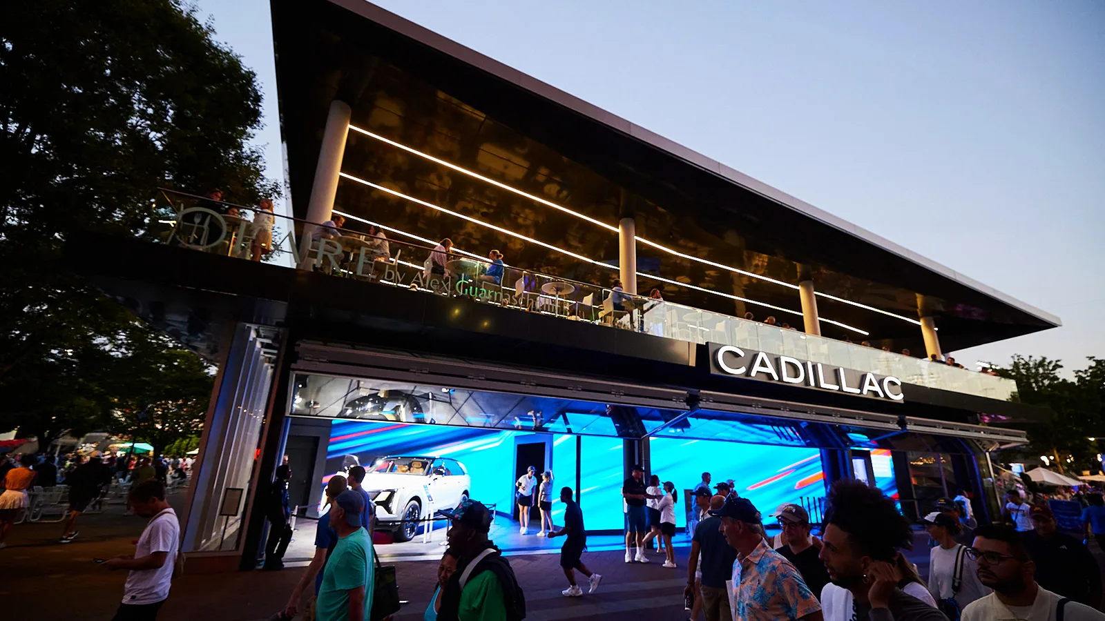
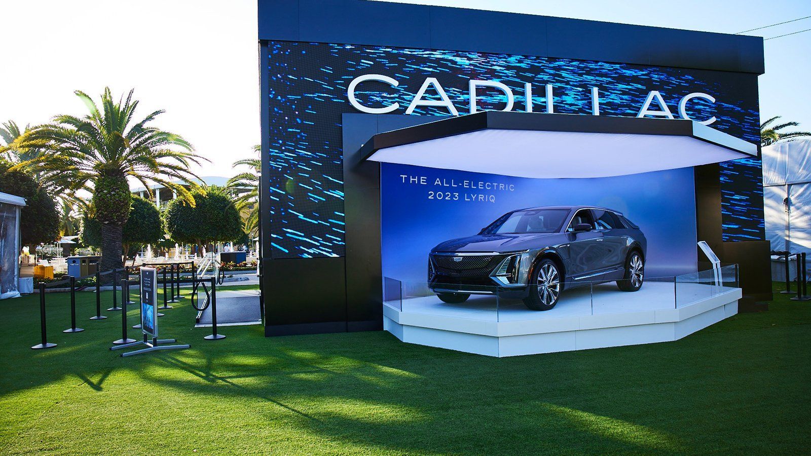
Cadillac 2023 US Open
360° Integrated Takeover
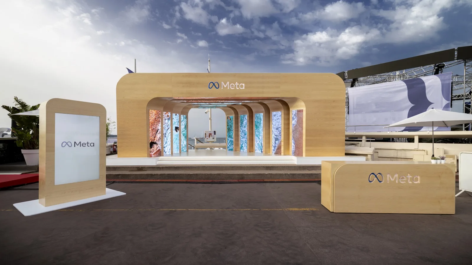
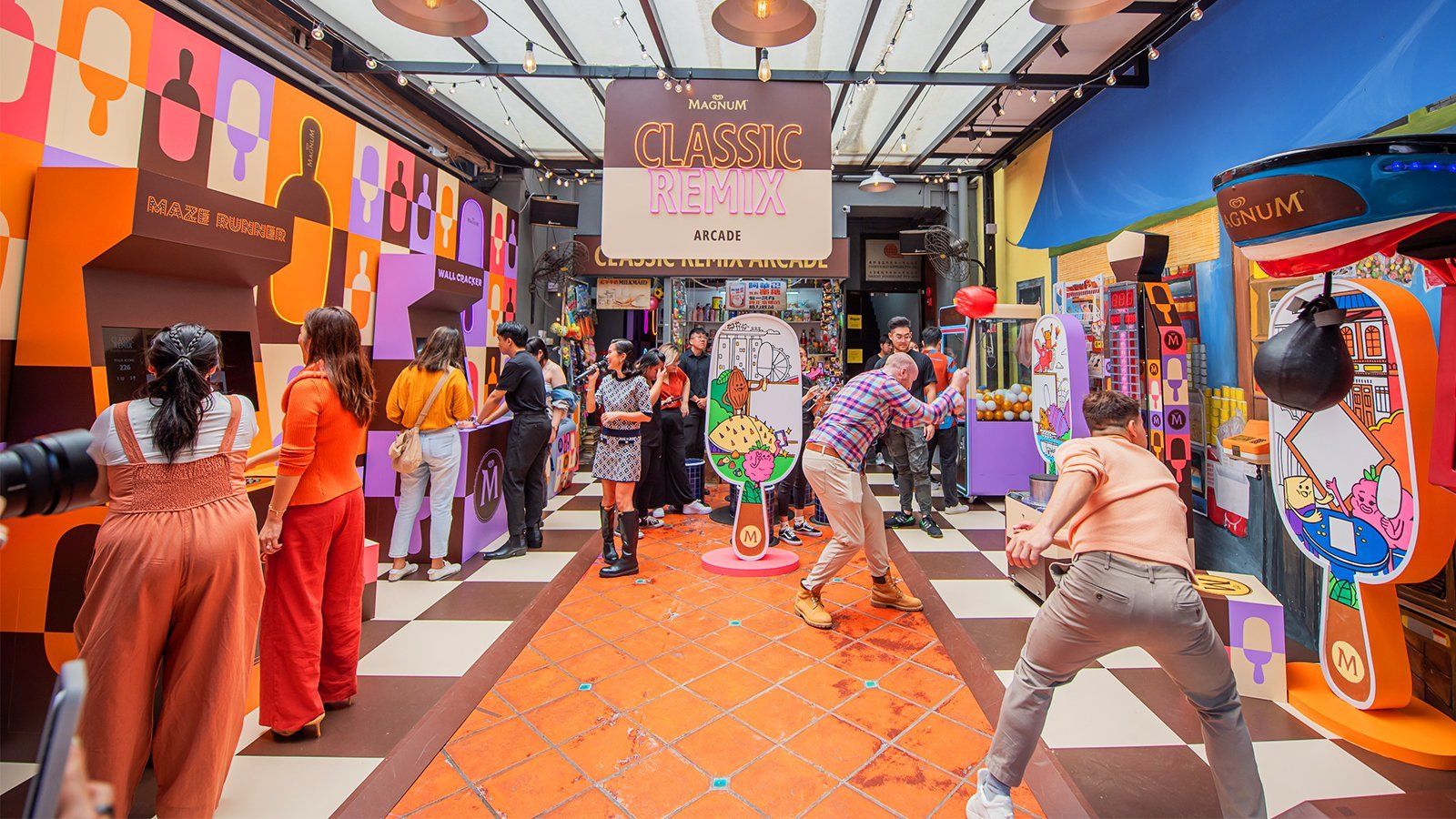
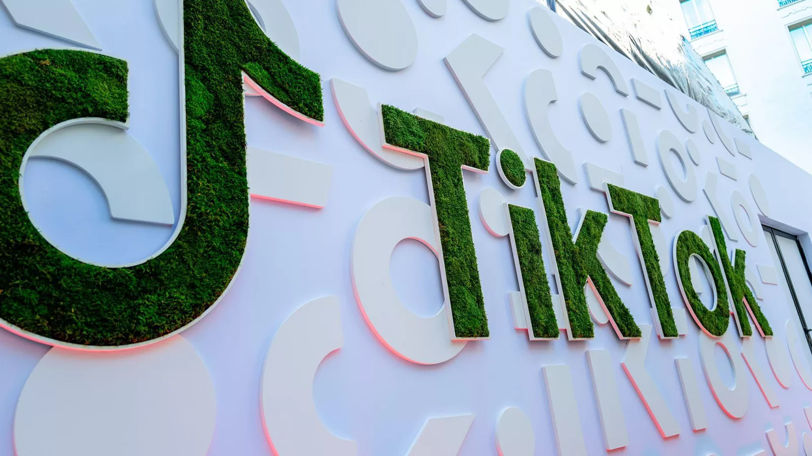
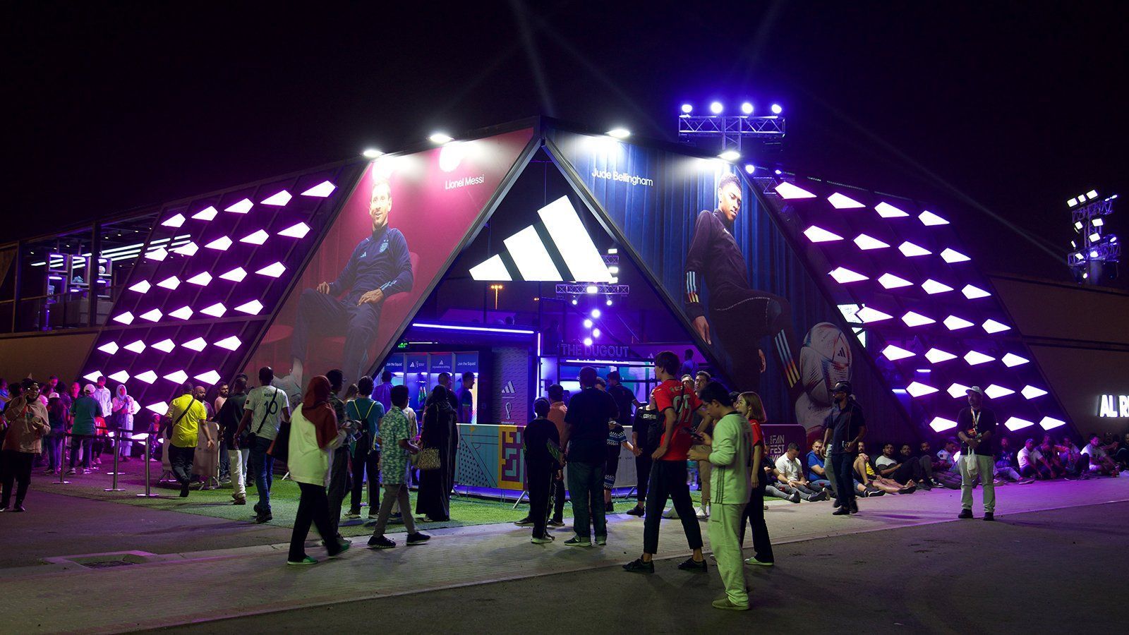
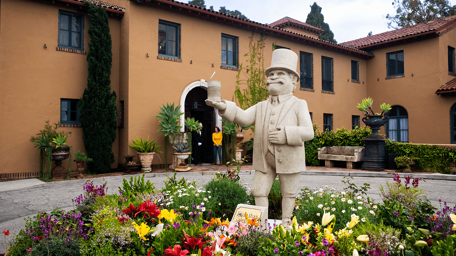
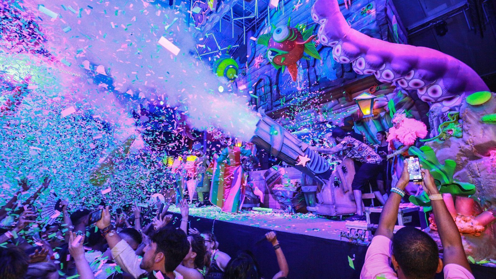
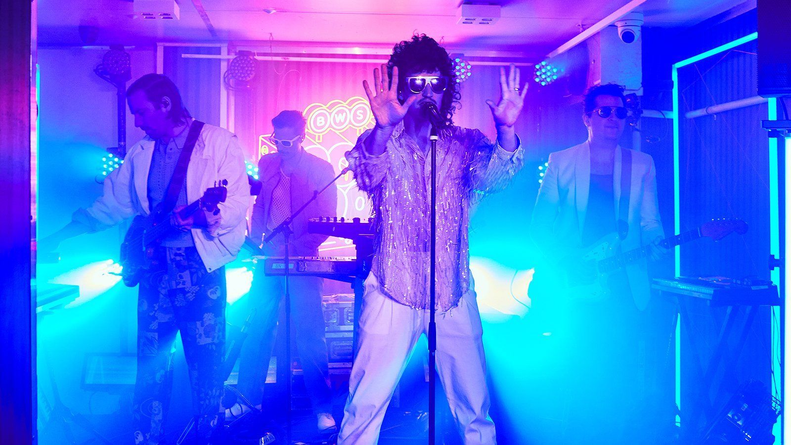
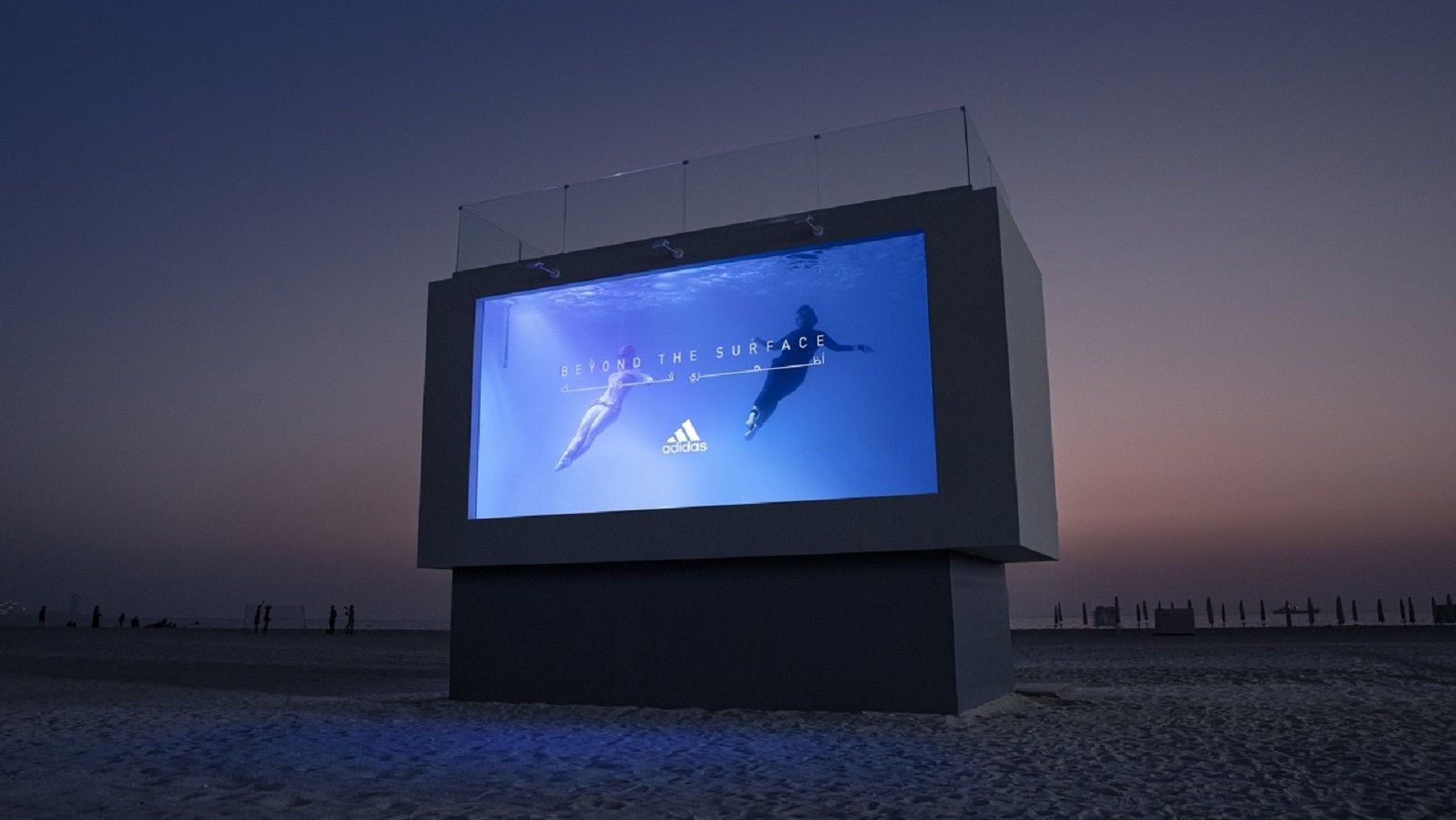
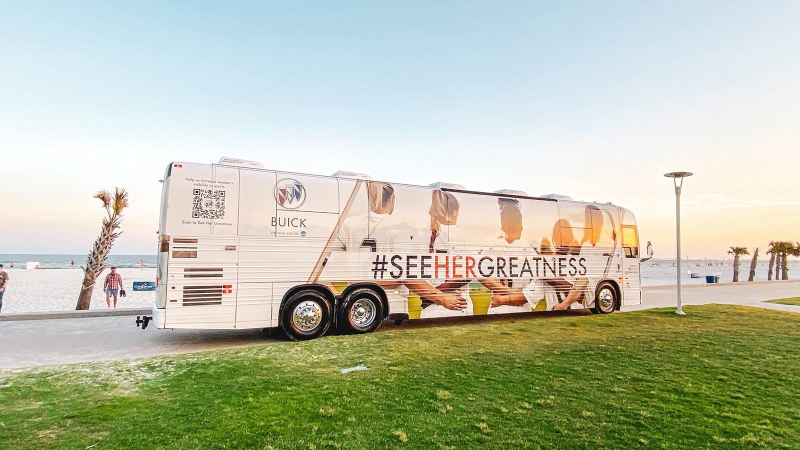
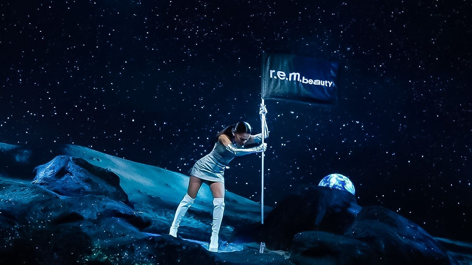
Additional Experiences
What makes us stand out? We're innovators in experiential marketing, harnessing over 80 years of expertise to continuously transform and venture into new horizons. From embracing the Experience Economy to leading in Web3.0, AI integration, climate-conscious design, and more, our agency is at the forefront of driving cutting-edge brand experiences that transcend industries and platforms. See how our agency captivates global audiences by pushing the boundaries authentically.