Jack Blog
May 12th, 2011
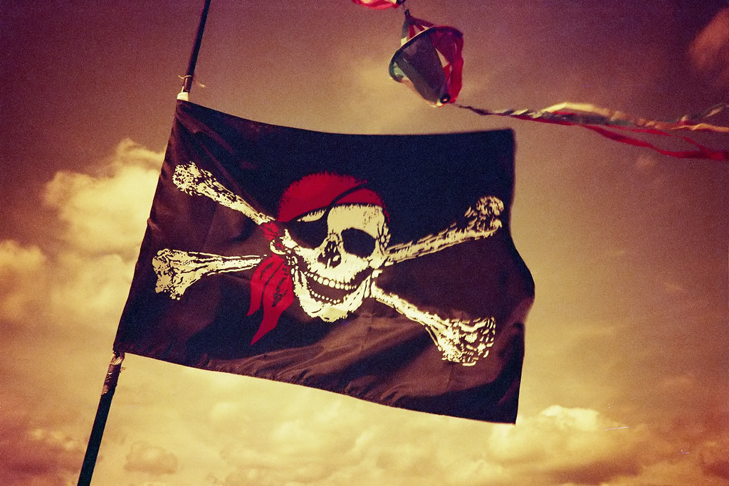
What is the most enduring logo? Not the Apple or IBM’s iconic logos, but the skull and crossbones. According to the New York Times it’s the “Jolly Roger” skull and crossbones that first appeared in the early 1700s and was rapidly adopted by most pirates.
“The key to its success was clarity of meaning, which is an essential element in every effective branding project, and any other form of communication design. Just as Nike’s ‘swoosh’ logo makes us think of speed and the horse-drawn carriage in Hermès’s identity screams posh, the sight of a skull and crossbones on a ship’s flag signaled one thing to 18th-century sailors like those on the Poole or the merchant vessels they were protecting: terror.”
The pirates’ strong brand caused the ships that they targeted to surrender out of fear, so the pirates used less ammunition, incurred less casualties and could pillage their victims more quickly, then they could presumably attack that many more ships, increasing their profit margin.
Evidently the Jolly Roger was also a very adaptable logo like the Nickelodeon and Google logos are today.
“A black flag signified that the pirates would ‘give quarter’ or spare the lives of those who surrendered, and a red one signaled ‘no quarter.’”
“Wynn’s hourglass declared that time was running out for his victims. Other pirates added macabre motifs such as skeletons, daggers or spears. One of Black Bart’s flags sported two skulls, each representing an enemy against whom he was plotting vengeance.”
Alas the power of the Jolly Roger logo waned quickly. By the mid 1700s the skull and crossbones had moved from being a icon of lawlessness to being adopted as a British regimental emblem and later the symbol for poison. It’s still a icon of the rebel and outlaw, but more cheeky than fearsome as it can be found on biker’s jackets and infant’s onesies.