Inside the NBA
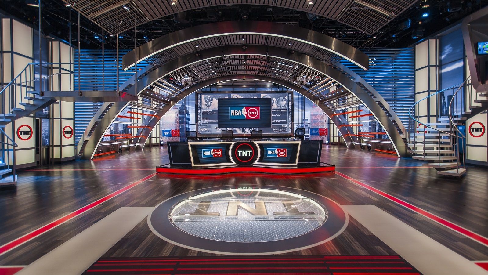
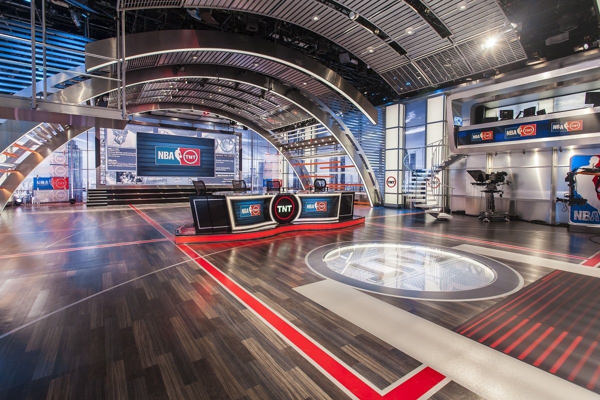
Our goal was to make the set feel modern, cool and contemporary without losing its basketball court feel, which its audience had grown to love. We wanted to add more modern styling that summoned a sleek, glass loft – a basketball court in the sky.
Overview
Inside the NBA is TNT’s landmark show about basketball, led by its hosts Ernie, Charles, Kenny and Shaq.
Our goal was to make the set feel modern, cool and contemporary without losing its basketball court feel, which its audience had grown to love. We wanted to add more modern styling that summoned a sleek, glass loft – a basketball court in the sky.
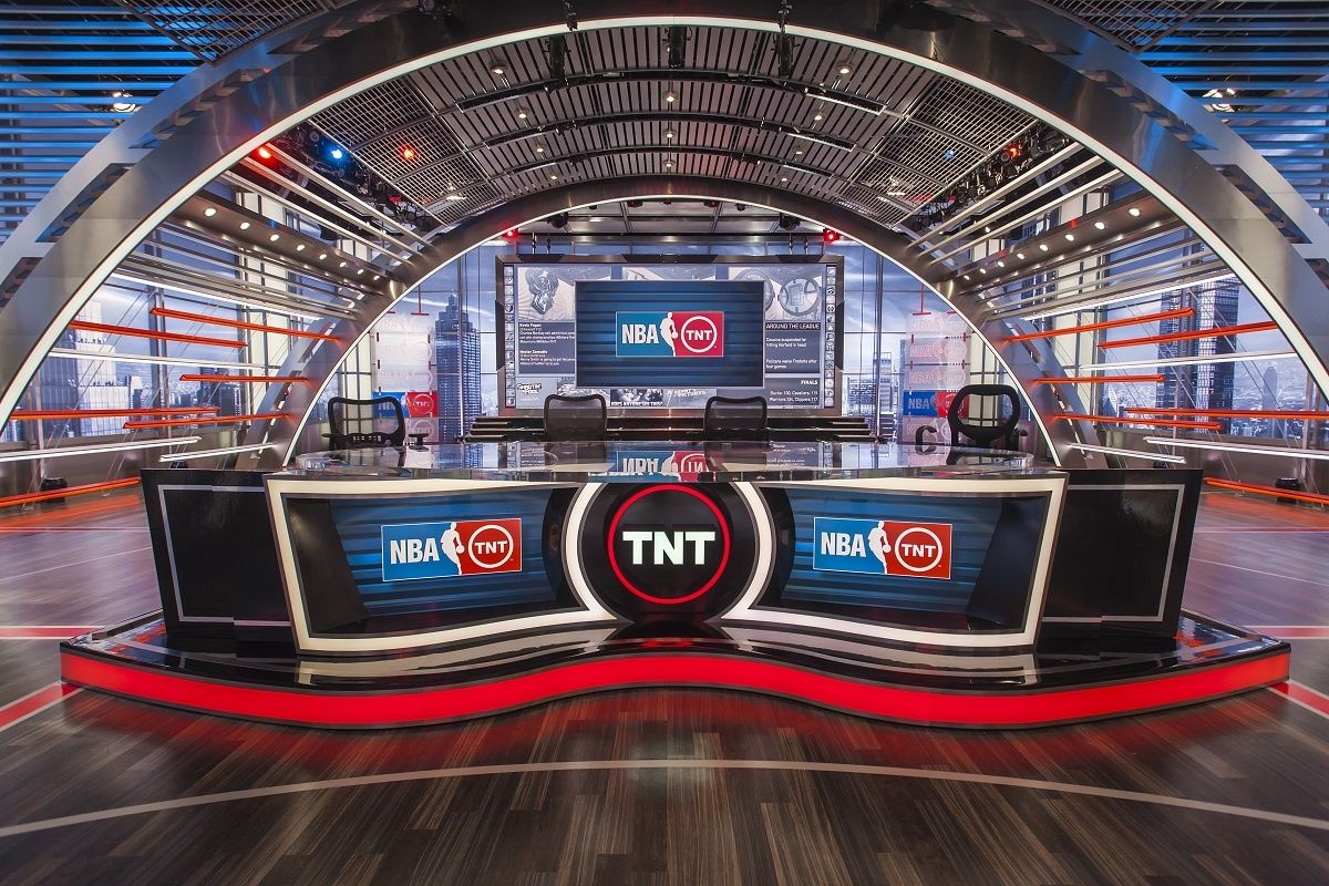
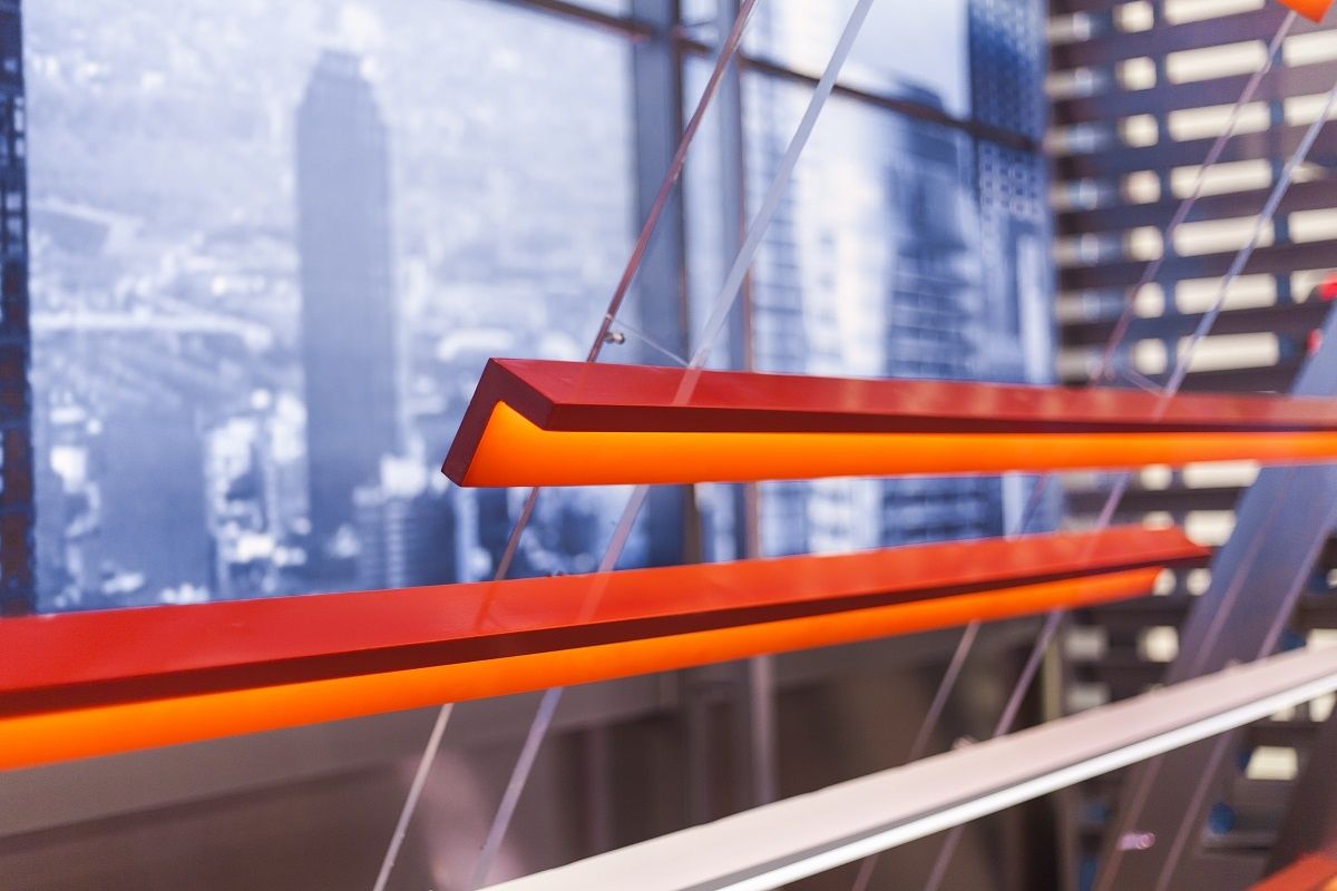
The sky-court set floats high above the rooftops of an Atlanta-inspired city, with its hosts holding court at their immense plexi and gloss black desk. From the previous set, only the grand arches remain. But even those have been updated, as they are now laminated in stainless steel. The new environment showcases 360 degrees of windows looking out to the majestic view, which allows favorable shots from any angle.
Highlights
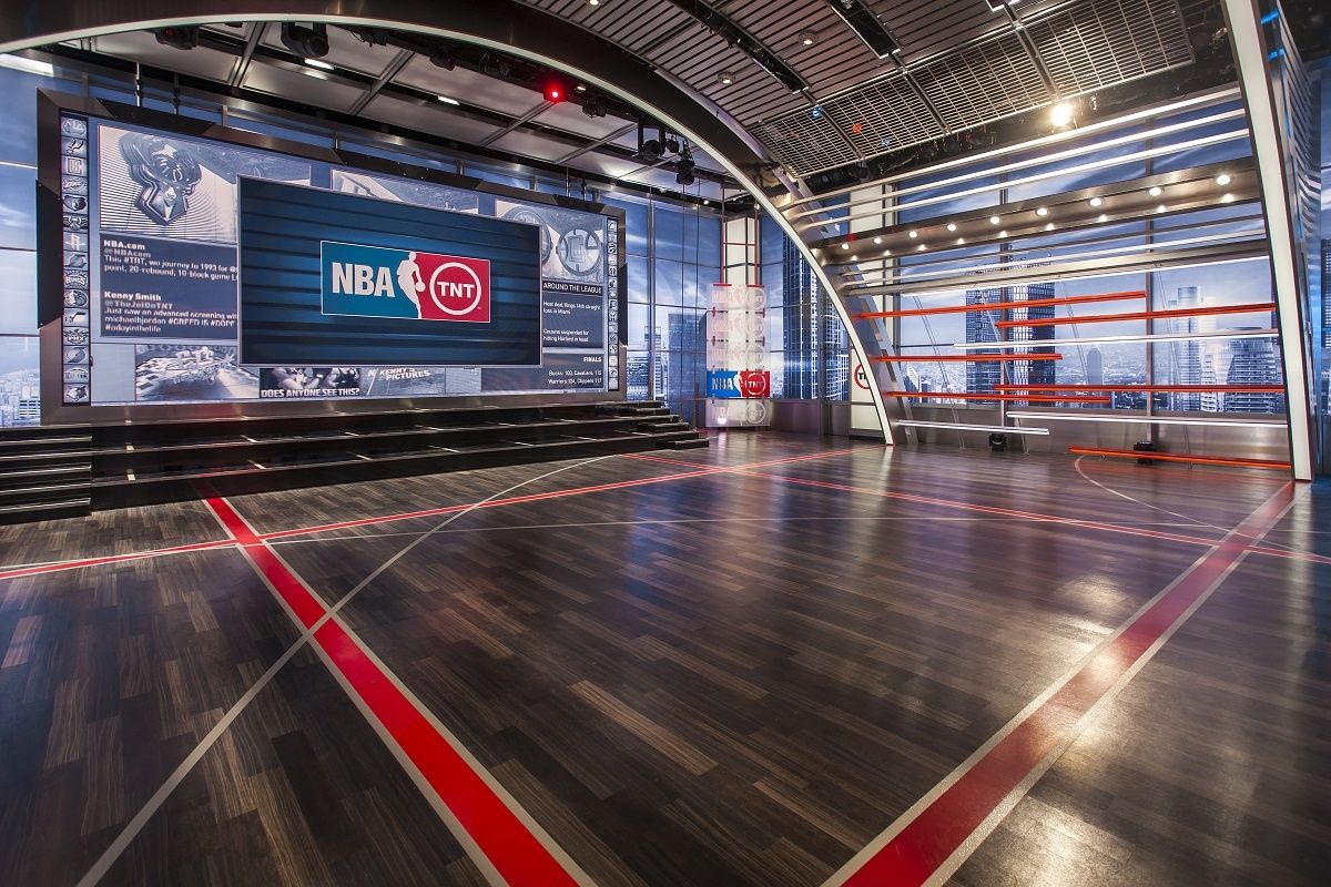
We wanted to make sure the set tied into TNT’s new graphics scheme for a seamless look and feel. The graphic skyline concept was developed specifically for TNT based on their graphics scheme. We created an Atlanta skyline while incorporating other buildings to make a fantastic and unique cityscape. 360 degrees of skyline light boxes created a skybox window view, up to 20’ high.
The demo area houses a regulation basketball hoop, shot clock and basketball key in the floor made of video tiles. The video floor is specifically made to stand up to heavy use: walking, jumping, bouncing a ball and even driving a car over it. We reconfigured the 32’ x 14’ LED wall on the south end of the set helped to create a spectacular background for the talent.
Our new design shifted the color palette from the previously warm feel to a more sleek, metallic and modern palette. The metallic materials allow color-changing lighting to play a huge role in setting the mood throughout the show.
While keeping the arch shape of the previous set, we opened up the space by creating slats that allowed the view to continue to the skyline. Ceiling pieces followed the slat approach, creating a ceiling that stops the visual from traveling off the set and allows spaces for functional lighting.
